I mentioned here before that I work Sublime Text 3 for my daily coding life! If there’s something that I particularly don’t like it is the sidebar theme. I think it contrasts too much with the current open tab one, unless you use a white based theme…
I love monokai and have been using it since the beginning. Here is a simple trick to make the sidebar look better.
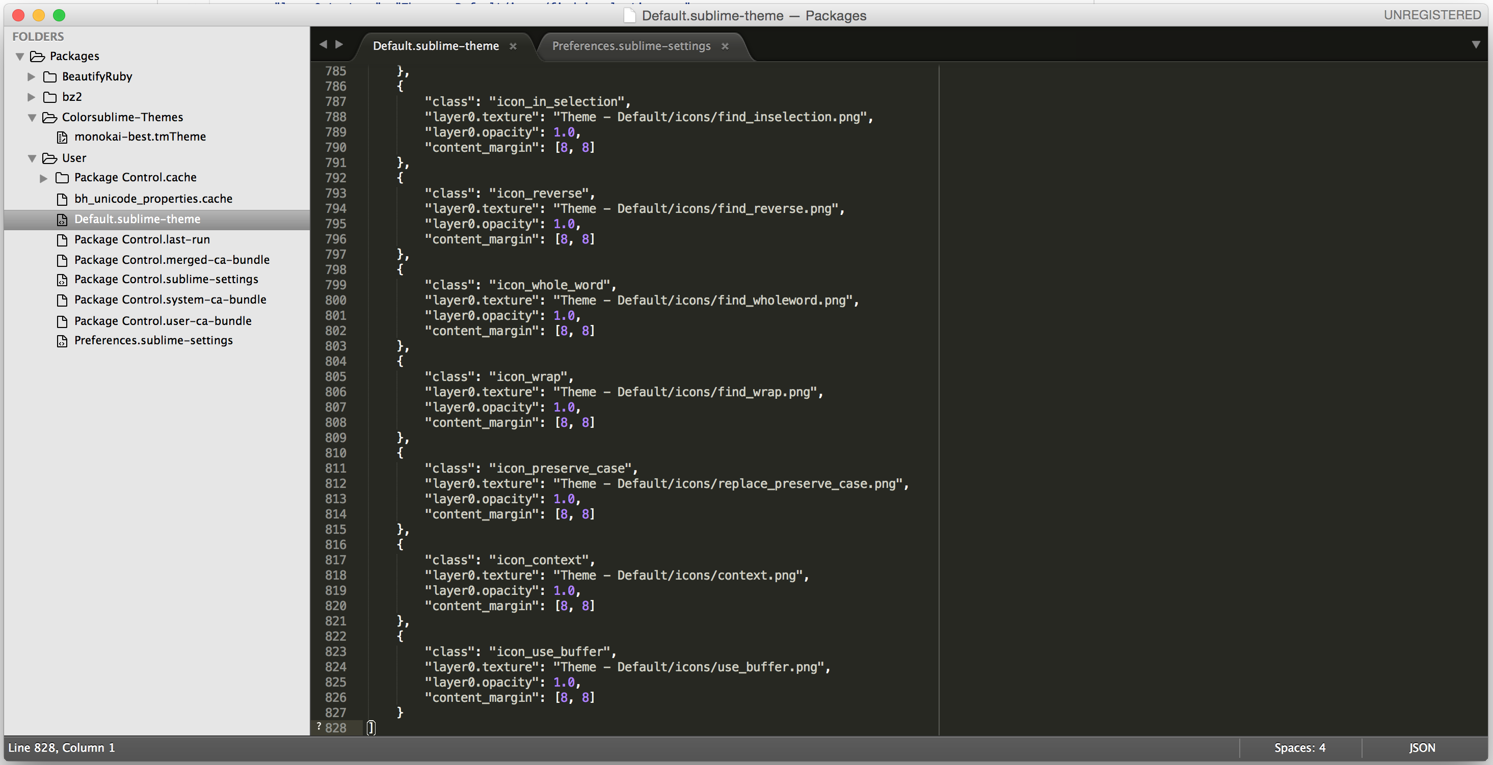
Default sidebar

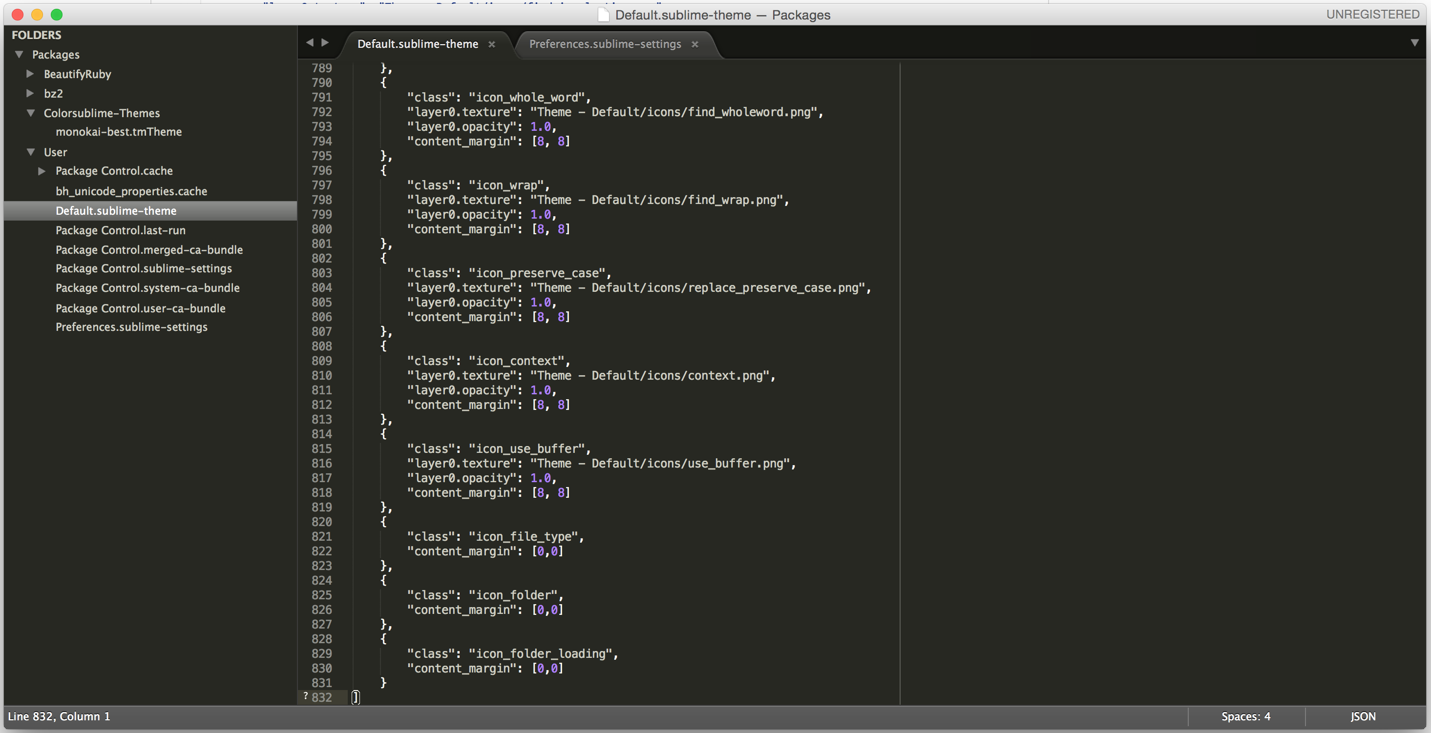
Modified sidebar

All you have to do is open your Sublime Text default configurations, if you’re on MacOS it can be found here
/Users/<USER_NAME>/Library/Application Support/Sublime Text 3/Packages/Userand the file is named
Default.sublime-themein case you don’t have it, just create one. The whole configuration can be found here.
In case you wan’t to return to the original one, you can replace back with this one or simply delete the file.
I hope it helps the SublimeText users out there. Cheers.